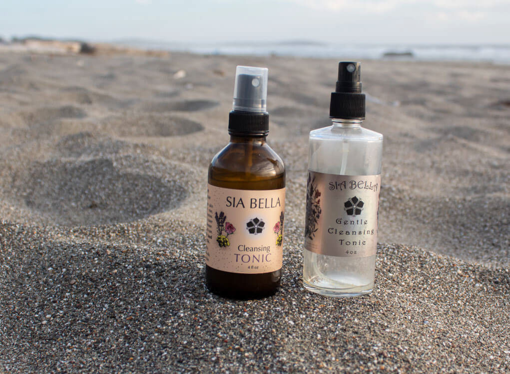
Service: Illustration, Label Design, Photography
Sia Bella Skincare was in need of repositioning the branding of its products to better match its core values. Using the purest organic ingredients possible that are good for the skin, without any chemicals, fillers, or alcohol.
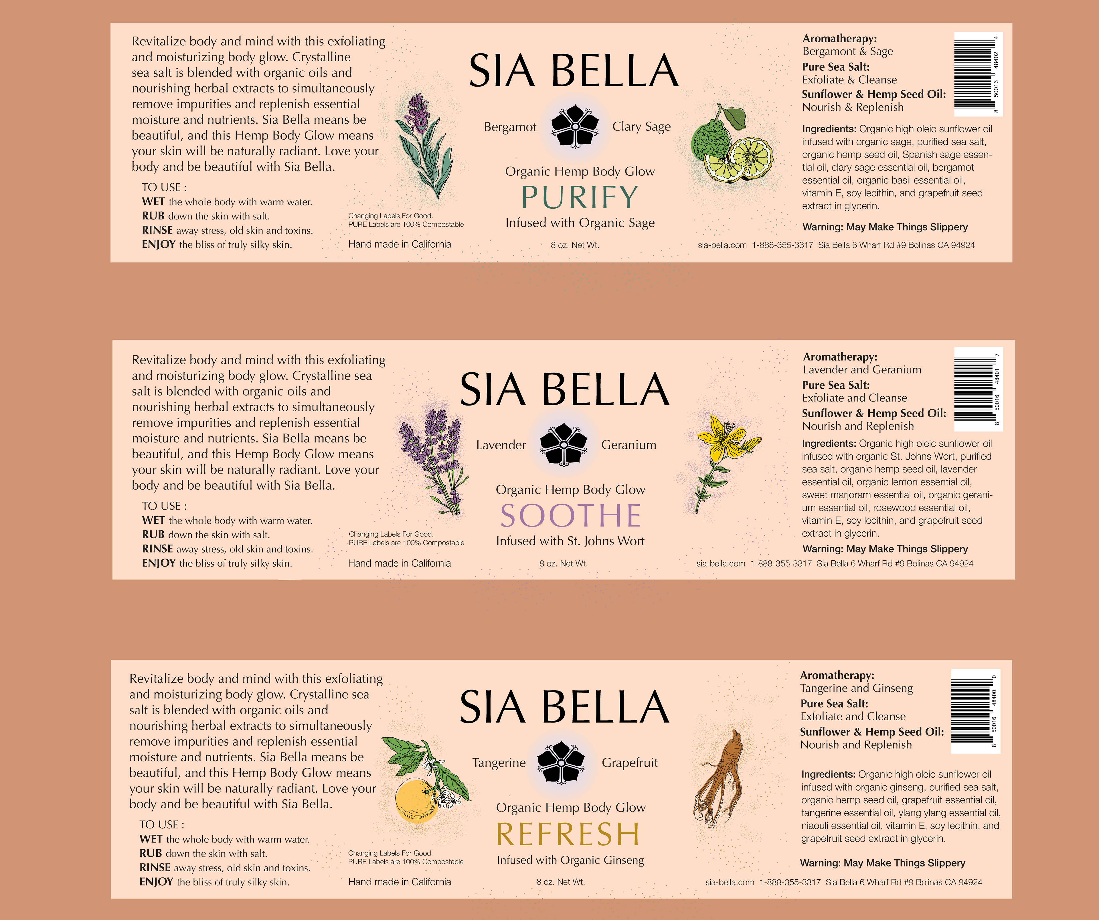
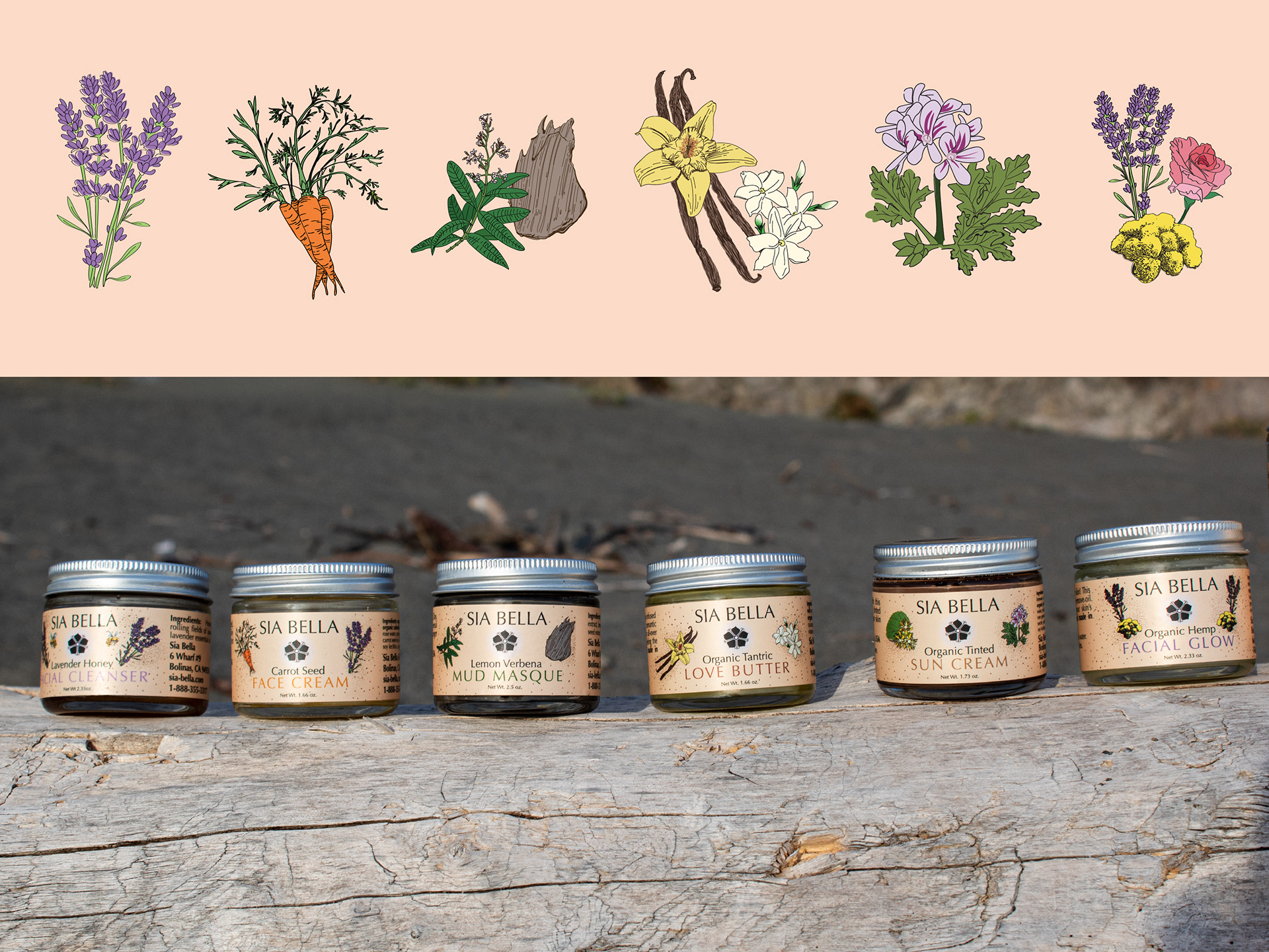
They hired me to create over a dozen hand-drawn illustrations and re-design their label to better speak to their target audience and create an authentic brand feel.
“Sia Bella, a luscious line of organic skincare that treats your skin with the knowledge, care, and purity it deserves.”
- Katy, Owner of Sia Bella
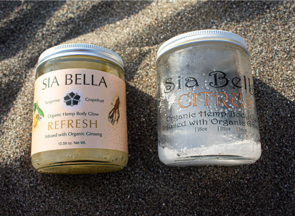
Before (right) & after (left)
Before (right) & after (left)
To best share this knowledge, care, and purity of skin care in a way their customers deserve, I needed to improve their packaging legibility and organization of information. Creating a uniform style throughout their line of products.
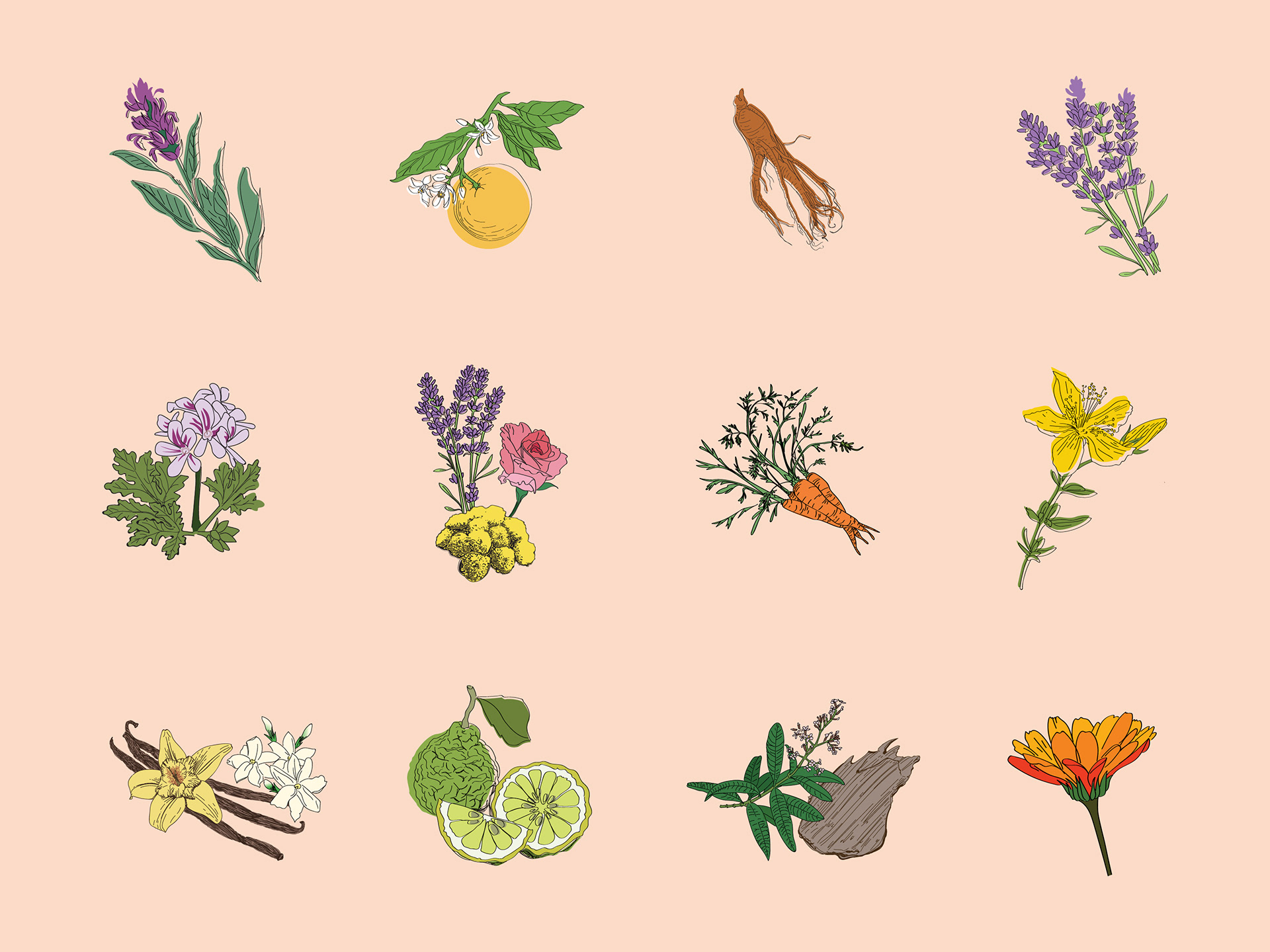
The illustrations I created for each product's plant-based ingredients were individual in color and texture but had a cohesive weight, form, and hand-drawn appearance that unified the entire product line. The product photography was added to my scope as well. Giving homage to the California Coast from which the brand was born.
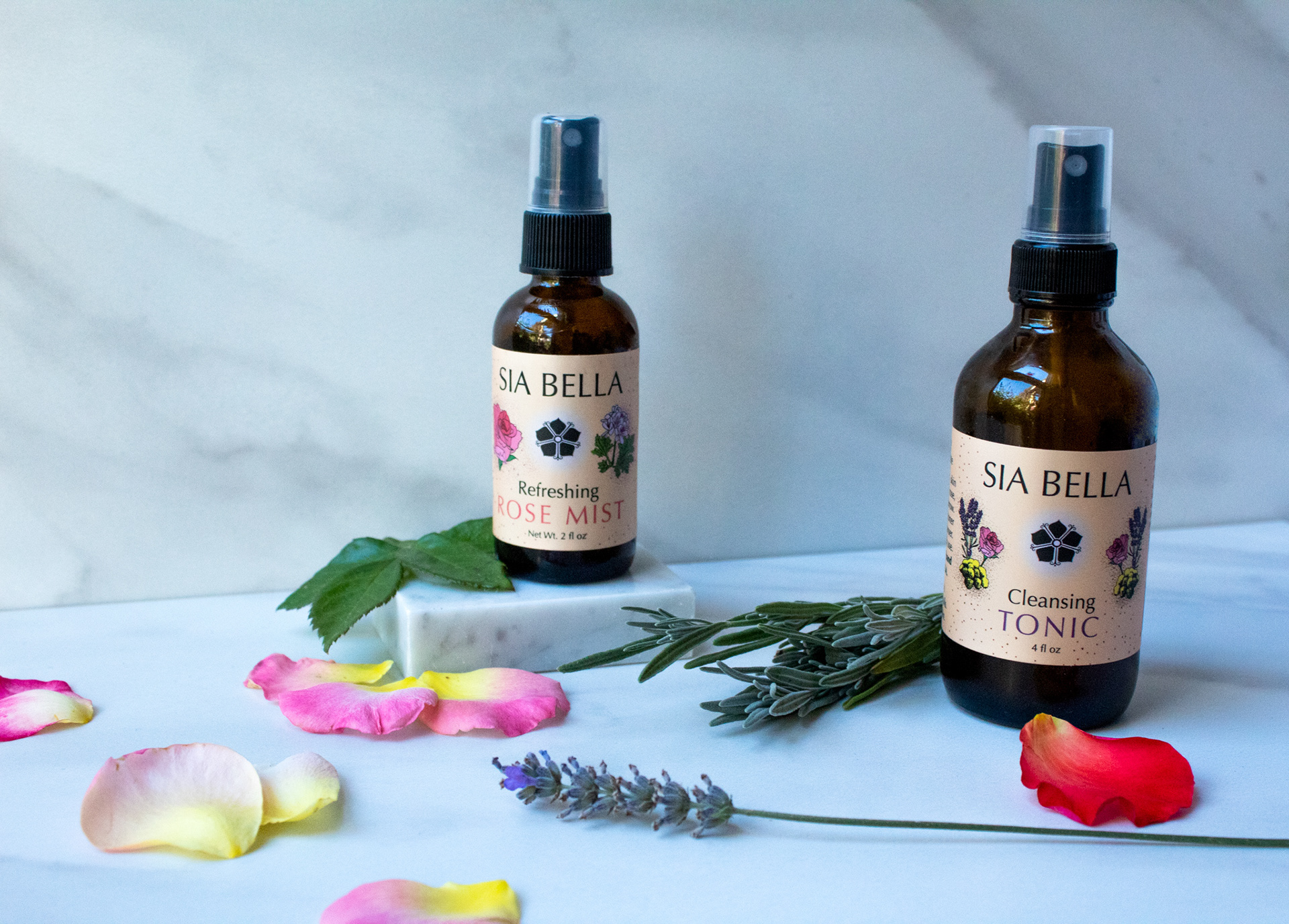
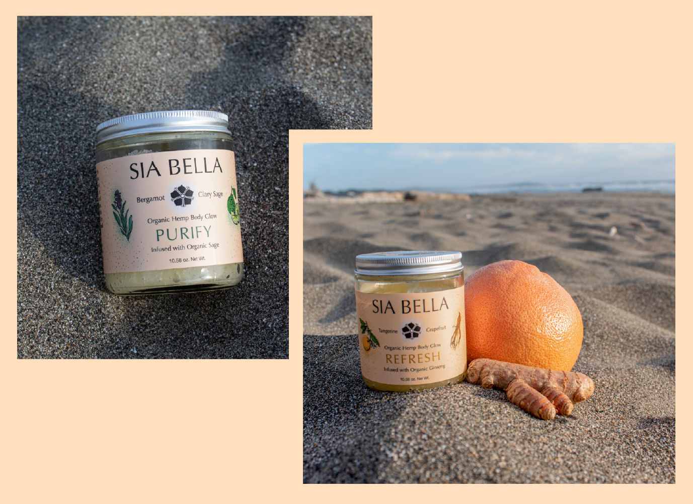
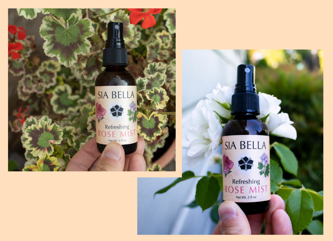
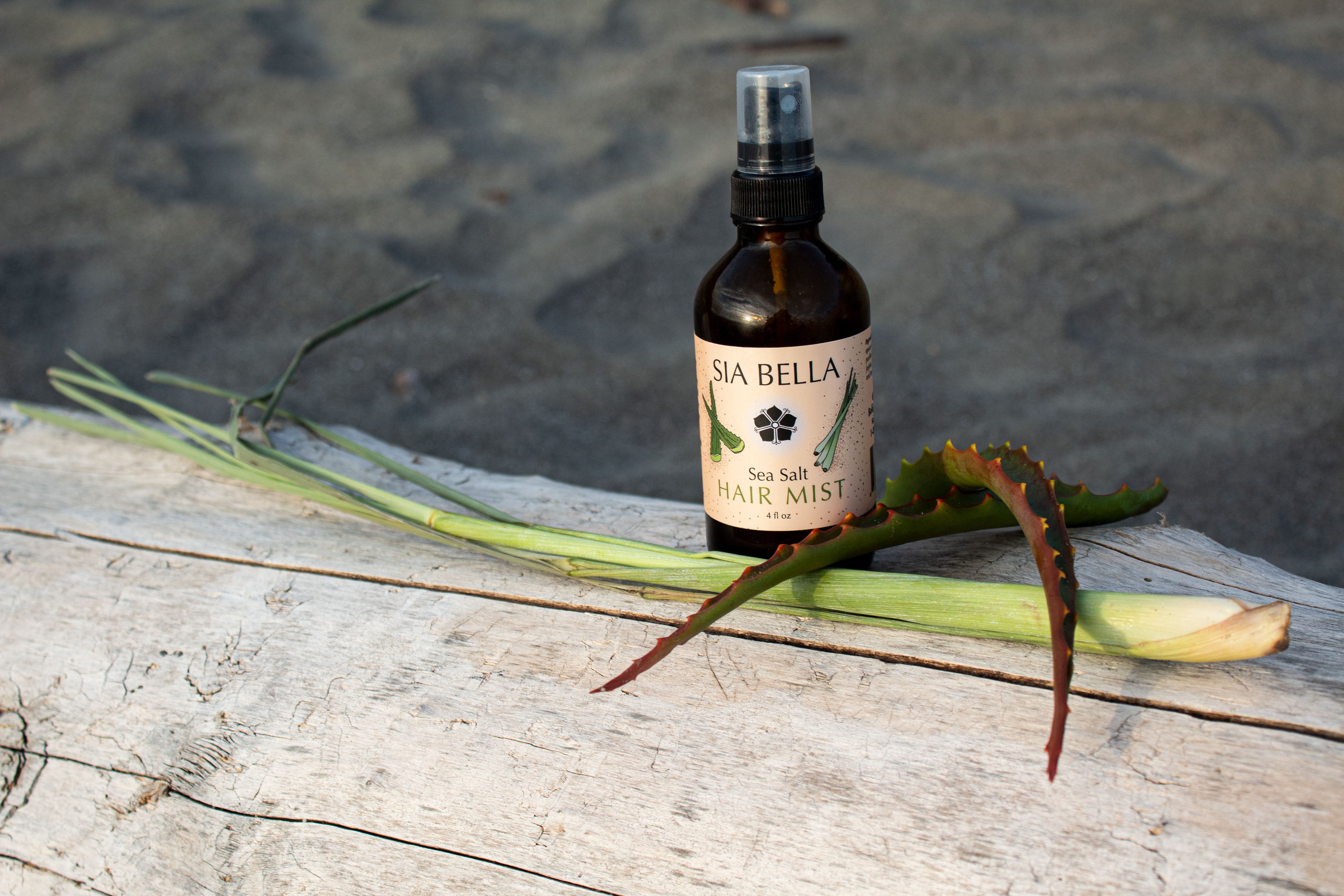
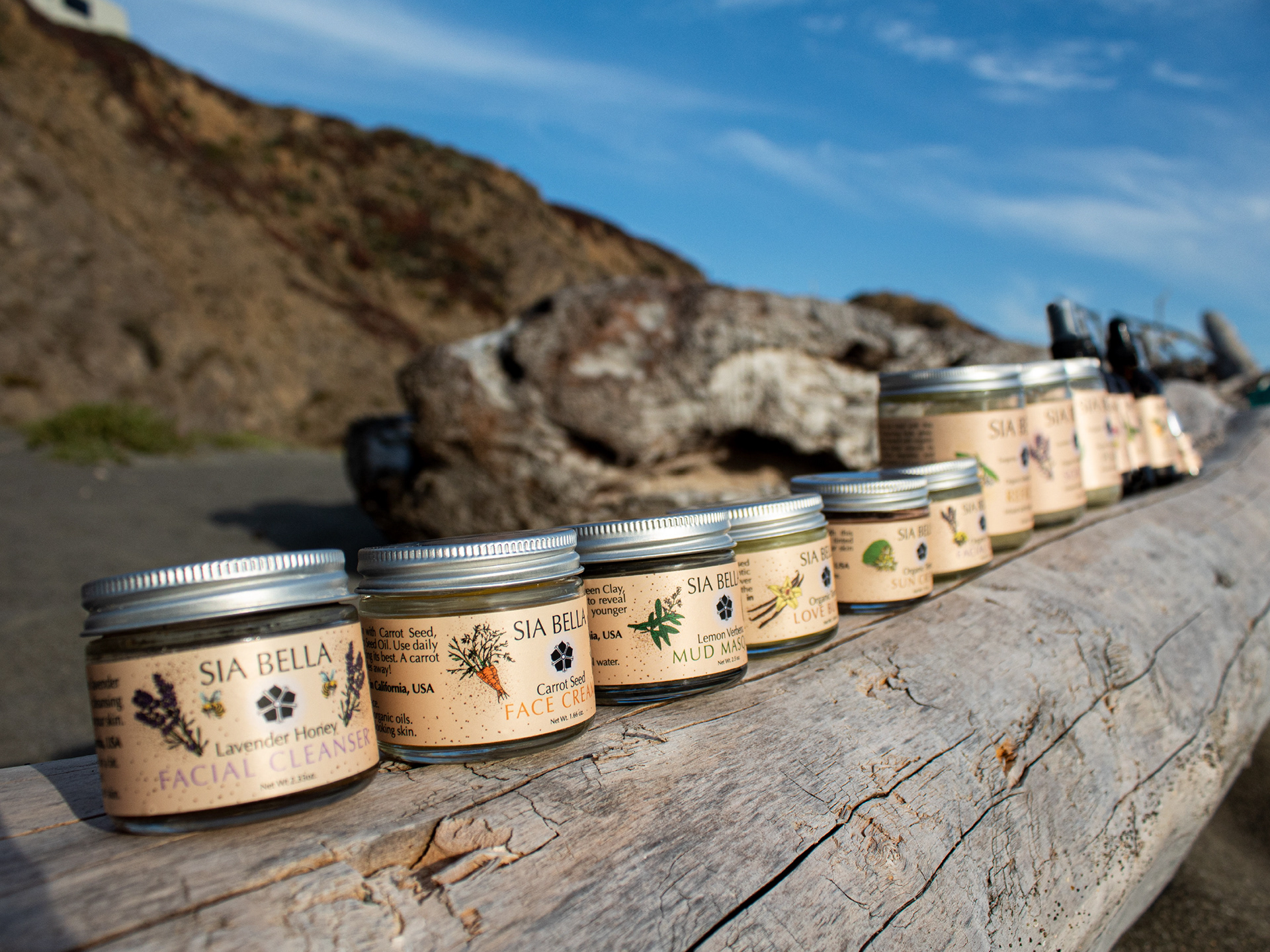
The chosen typeface and colors echo luxury while still feeling warm. Giving the nourishing line of products a look that plays into Sia Bellas core, skincare that is affordable but never cheap in quality. They feel as good as their ingredients sound. This women-owned business creates their products for all who love their skin.